
Image: Edward George
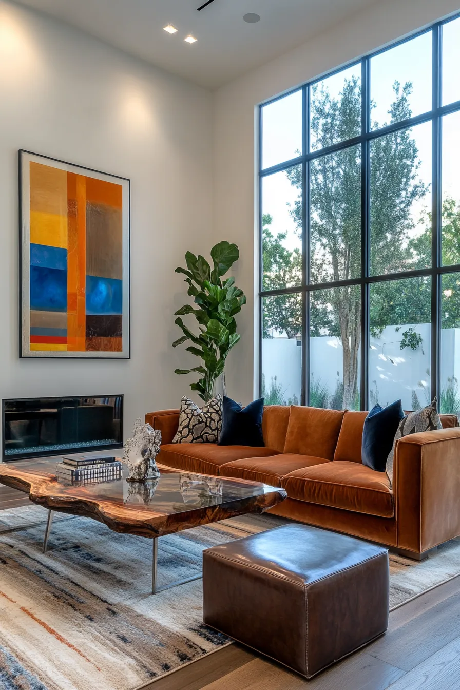
The population of London has grown over the long term, and new modern developments are always being constructed in an attempt to meet growing demand. Recently, Nine Elms in Battersea has seen a huge number of new apartment blocks go up in an area that was once mostly industrial wasteland, and the riverside around Putney Wharf, redeveloped in the 2000s, is an established destination for homes, shops and restaurants. However, modern property developments can pose a challenge for decorators, sometimes feeling cold or characterless. Here are three colour schemes that can help bring a modern space to life and maximise value.
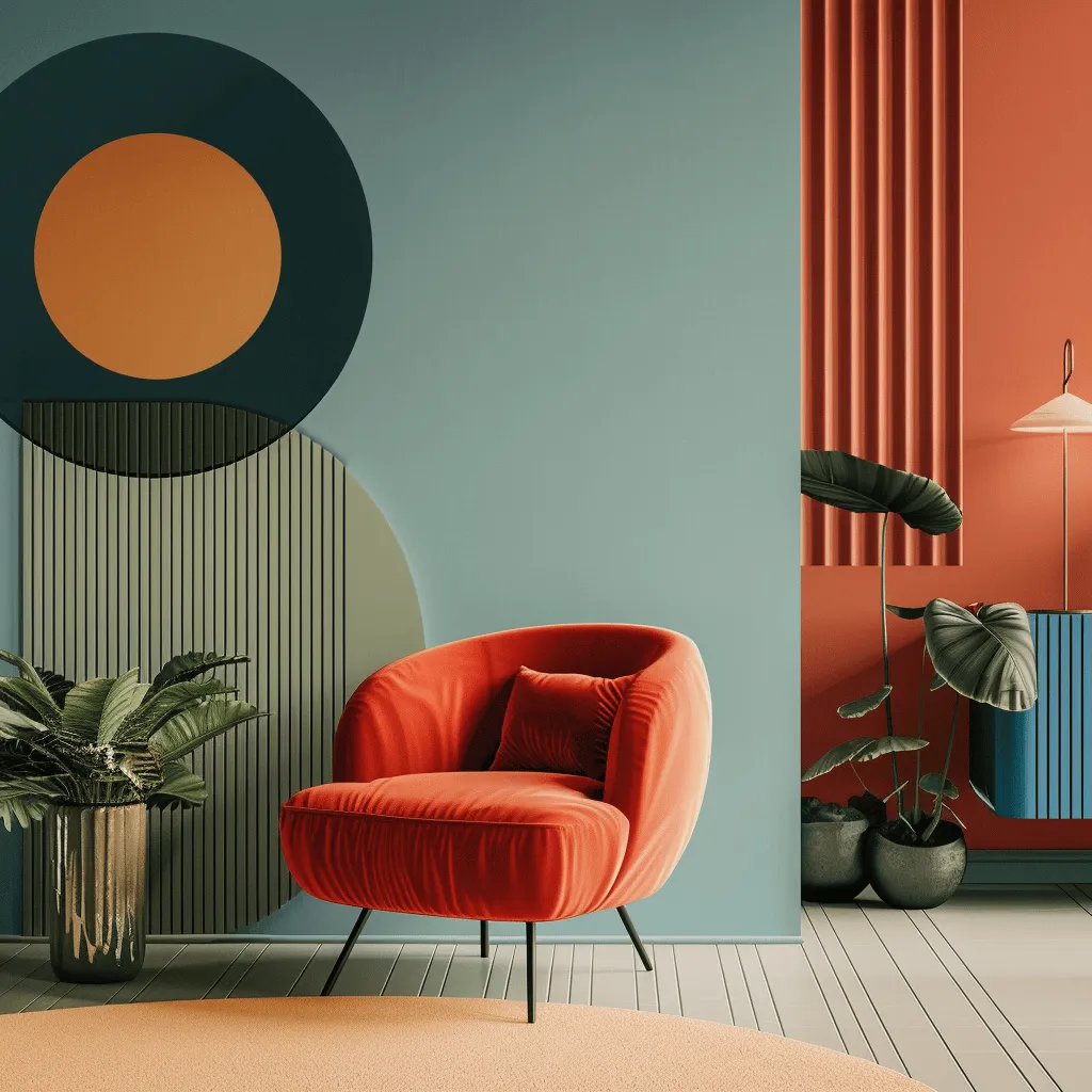
Image: edwardgeorgelondon.com
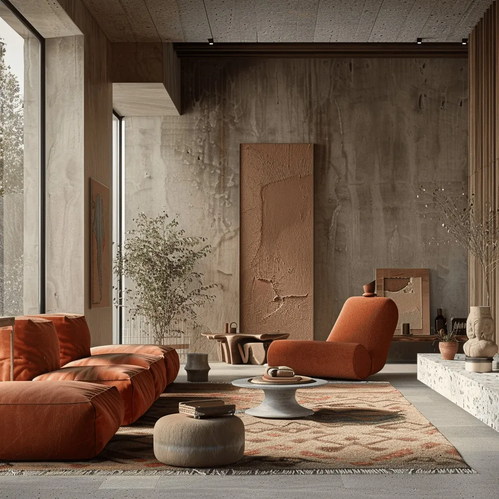
Image: edwardgeorgelondon.com
Earth tones
Shades like terracotta, clay and ochre are extremely popular at the moment, particularly with the Instagram generation. Sun-baked tones bring warmth and richness to a space, something that’s especially important in urban environments in the UK where overcast skies are the norm. This kind of palette is particularly effective in softening modern architecture and bringing a sense of connection with the natural world, something that is often missing from contemporary urban developments.
Neutrals
Sticking to a range of subtle whites, taupes and greys is a sensible choice for many property developers in an expensive city like London. A neutral palette creates a sophisticated feel while allowing buyers or tenants to envisage the property as a ‘blank slate’ that they can make their mark on.It also offers an unobtrusive backdrop for any brightly coloured furniture orartwork they may already own. Remember that not all whites are created equal!Warm white paint colours with undertones of red or yellow create a warm glow,while cooler whites with undertones of blue or violet help a space feel crisp,minimal and fresh.
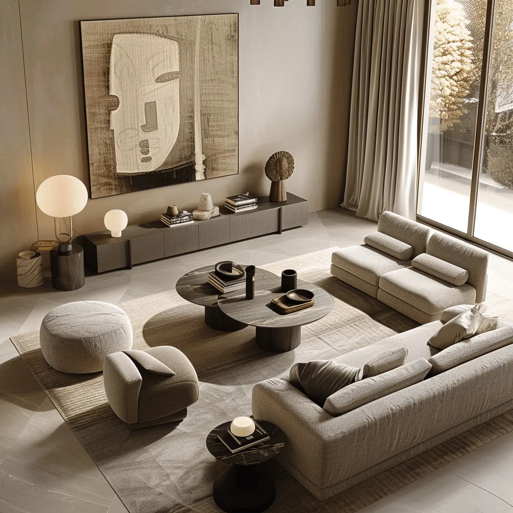
Image: edwardgeorgelondon.com
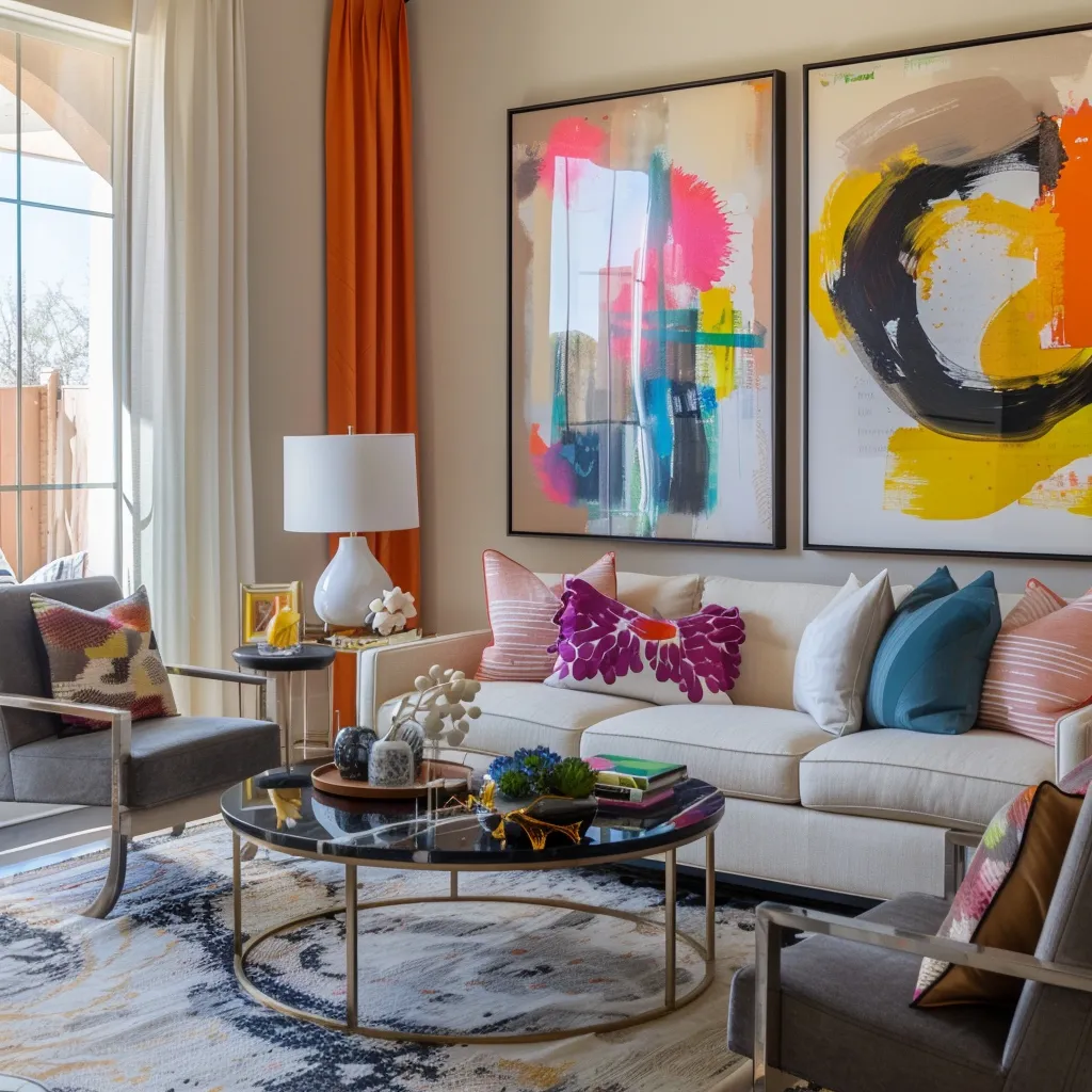
Image: edwardgeorgelondon.com
Electric brights
Some people who buy a modern property like to lean into the aesthetic by using a palette of bright, highly saturated colours like neon green, hot pink or electric blue. These shades are often associated with feelings of energy and youthfulness and are popular with young professionals in the creative and tech industries. They can help add a sense of style and playfulness to spaces that don’t have original features or other points of architectural interest.